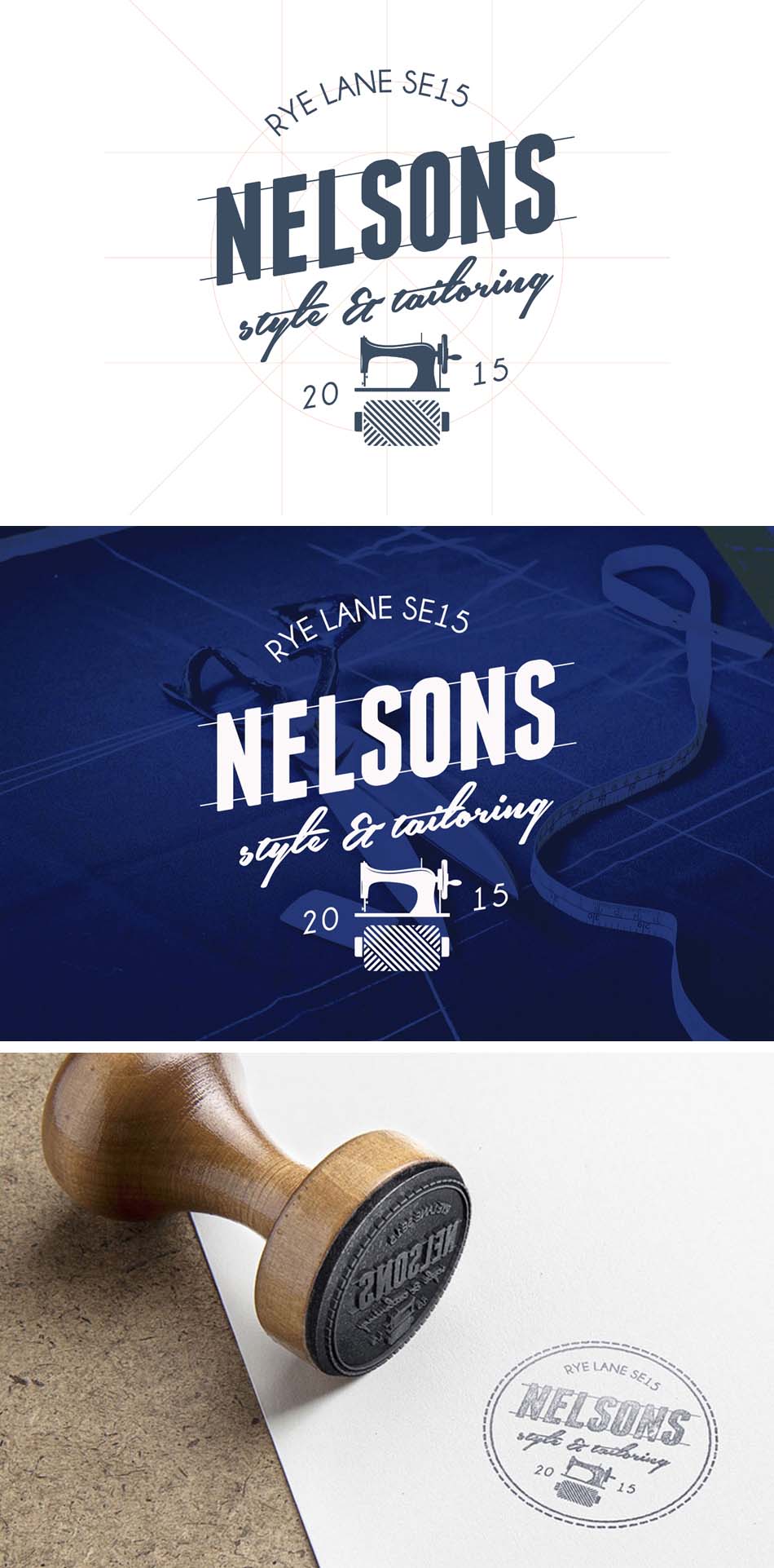
Design

Responsive Branding

Currently knee deep in a strategic rebrand project, with ambitions for a durable identity which will be seen across the globe (more detail on that soon). I thought I’d share the approved logo, influenced in part by the responsive design age we now live in.

I believe that good design and great branding integrates a degree of flexibility, allowing a freshness into communications which maintains recognition of the identity across a range of mediums. Well-designed identities should have different variations available, however quite often there are some sensitivities – mostly relating to a sacred view of an identity being rigid and it’s permanent presentational form.

But with Google now favouring websites enhanced for mobile, it’s more important than ever to deliver subtle flexibility and ensure logos are adapted to break the screen constraints and work as best as possible at any size.

In fact with logo’s in particular, applying this ‘responsive design thinking’ can actually support and enhance the solution, which is why I include this as part of my design process (scalability is logo design 101, but developing a design that incorporates recognition through responsive simplification can be tricker).

Exceed responsive showcaseSee. Flexibility can support and enhance the identity. More on this project, and others, soon.

Read more →

Don’t call it Hipster

One of today’s biggest logo trends is the ‘Hipster’ style, however the web is also cluttered with posters, illustrations and sites all following this aesthetic. Hipster design is usually minimalist and simple but have a unique way of conveying the message with a modern, rustic and vintage vibe.

Unfortunately the majority of these hipster logos are terrible and generic as hell. With them often overcomplicating the design by adding unrelated flourishes and arrowheads! Yuck.

The whole point of a logo is to be identifiable, unique and memorable – you can read more about my approach here. There is a point where this Hipster simplification becomes too minimalist and in some cases abstract, with the identity and flavour of the company completely lost. Besides true minimalism isn’t ‘hip’, it’s a key design principle that should never go out of fashion.

Cue Nelsons

So when designing an identity for mens tailoring and fashion outlet, Nelsons, within the rejuvenated area of Peckham South-East London, my goal was a balance of depth with a timeless, and dare I say it, ‘trendy’ aesthetic.

Offering cool classy threads with a sophisticated edge, Nelsons stock unique short run designs using quality materials, all wrapped up through the approach of a personal tailored experience. They are friendly, passionate and fashionable just like the logo.

You can see my outcome below, with more to follow soon including letterpress and fabric prints and even some gilded window signs. Very Hipster. …Oops!


Nelsons

Read more →

Web Wireframes

You’ll have read my previous post on the process of design? No! well click here. This is part two because I do websites too! All my projects begin with a kickstart meeting, where we discuss your vision and requirements. From there we can then agree a plan and begin.

In the case of websites, wireframes could be seen as the initial plans. Wireframes as the name suggests are ‘just’ simple line drawings of a pages that are used to plan out the website before it is truly designed.

However they are a lot more. Wireframes allow you to think logically about the design, they allow the structure to be visualised, discussed and agreed. Creating these wireframes identify and confirm the purpose for each page, key ‘Call To Actions’ and other important information which needs to be prominent on the page. Giving focus and a more efficient use of time.

I also create a sitemap which is useful to determine the structure of a whole website, it can however be quite daunting to look at, especially for more complex sites. With the wireframes we are able to visualise this sitemap and see how pages fall into place. This can be useful as it may bring to light ways the sitemap could be adjusted to make for a more simple user experience and improve the design, something I love!

This is a process which proved to be successful in delivering my latest website for Leeds based agency, Abyss Marketing. Allowing productive conversations and visualisation from both sides.

Wireframes

So there you are, a further insight into how I work. If you want to know more or work together and start a new project, get in touch

Read more →

Design Planning

I’m currently involved in the early stages of what’s already proving to be an exciting project – to re-brand and effectively relaunch a business with an ambitious target, within a difficult economy. But there will be more on that later.

However because of this I thought I’d give some overview into the creative process I follow, although not exhaustive…as I can’t give away all the secrets now can I, but also because the design process is ‘organic’ (it’s alive!). Furthermore I’ve also shown some considerations for developing that killer brief and how that can help maximise the project – something I’m always aiming for. After all good graphic design is structured around ensuring the client gets high quality solutions appropriate to the business and marketing ambitions.

You can see these steps detailed below, how it plays a role in my work, and if you’d like to know more or use this to start a new project, get in touch. Oh, and stay tuned for more on that exciting re-brand project coming early 2015.

Creative Process

Read more →

Tweaks & Niggles

I never present an idea I’m not proud of, I really believe you are only as good as your last job – therefore I set my standards high. I’m also mature enough to take feedback as a valuable tool to improve the aesthetic or overall idea. In fact a great skill I’ve developed over the years is learning not to be precious, it’s often with the benefit of time and additional input where a good idea can develop into a great one. And I’m all for that!

And so a few weeks back I started working on some designs for an exciting new business developing a strong identity that met the original brief (and yes, one I was proud of). However as the project grew and I continued to work with the client I realised on application of the concept that the visual ‘fit’ with the business wasn’t as good as it could be.

Taking the bold step to develop and pitch an alternative was risky stuff considering the original was so well received (and we’re always working towards a deadline), however from my experience it was an exercise I believed we had to take. And as it goes it was a measure that was greatly appreciated by the client, as we now move forward with a stronger solution.

So there you go, greatness takes time (and some reflection) but it’s always worth it! You’ll see more of this soon but you can read the original post and view the concept here

SkyOps_new logo

The new icon looks fantastic! No disrespect to the last idea but I think this is a massive improvement – really distinctive and awesome visual association.

Ed Speakman, Director – SkyOps

Read more →

Flying high

Seen Danny Macaskill ‘Ride the Ridge’? Well it’s not just his stunts that push the limit, but also the technology that made us dizzy by filming all that insane action. Using the latest unmanned aerial vehicles (UAVs) or remote controlled drones – depending how CIA and Jason Bourne you want to be – the filmmakers are able to put us right in the action and capture all the detail in glorious high definition.

This innovative technology isn’t just being embraced by Hollywood but also another technically focused sector, the Offshore Energy industry. These lightweight and portable UAVs allow the visual inspection of difficult to reach parts of the oil rig without endangering personnel or production. Clever stuff. And so, after being approached by a new company entering the marketplace to come up with a striking identity, I was well up for the challenge. My drive was for this to be technically relevant, but also clean and recognisable, delivering a confident solution. Using the company name to give enforcement, rotor blades, and a mix of surveillance/camera lens as inspiration, I came up with this simplistic ‘icon’ for the logo:

SkyOps-logos

What can I say, you’ve absolutely nailed it…I’m sitting looking at it with a grin on my face!! Love the effort that has been put into the thought process and how eye catching the final design is.

Ed Speakman, Director – SkyOps

Feedback has been great and I can’t wait to see how the company grows and what projects they work on. So if you like what you see and want some similar design treatment from my professional approach get in touch! Oh, and check out Danny’s awesome film here

Read more →

Bangin’ flyers

The hype from one of my latest commissions is heating up! With the North East soon hosting one of 2014’s biggest DJs, Nick Curly. Curly first cut his teeth with a residency at the legendary Vibration Club in Germany. Since then he has gone on to hold down residencies in Ibiza at Space, where he helped define the sound known as Mannheim – a deep and tracky style that is loopy and involving, folding you into the groove with soul and melodic beauty.

Nick has played the world’s biggest and best festivals including Womb in Tokyo, Sonus Festival in Croatia, D-Edge in Brazil, Eastern Electrics Festival In London, Love Family Park in Germany and Gypsy Club in Russia.

So get your glow sticks out!! With tickets available here

Club Flyers

…and remember to contact me if you need quality design to promote your club night or event. 🙂

Read more →

Designs for your big day

That’s right, I also do wedding stationery too! In fact I recognise that it’s completely personal when it comes to wedding invitations, and a bespoke design for your wedding stationery is something you will always treasure. Therefore I offer a completely personal design service, creating to suit you and your day, setting the scene and standard of your wedding.

I aspire to make the whole experience stress free and exciting. By combining the magical sense of occasion and romance, I can help you strike a balance between visual elegance and practicality, ensuring your unique wedding invitations deliver the ‘WOW’ factor when inviting family and friends to your big day.

Some samples are shown below and contact me for more information.

Wedding Mockups

Read more →