Don’t call it Hipster
One of today’s biggest logo trends is the ‘Hipster’ style, however the web is also cluttered with posters, illustrations and sites all following this aesthetic. Hipster design is usually minimalist and simple but have a unique way of conveying the message with a modern, rustic and vintage vibe.
Unfortunately the majority of these hipster logos are terrible and generic as hell. With them often overcomplicating the design by adding unrelated flourishes and arrowheads! Yuck.
The whole point of a logo is to be identifiable, unique and memorable – you can read more about my approach here. There is a point where this Hipster simplification becomes too minimalist and in some cases abstract, with the identity and flavour of the company completely lost. Besides true minimalism isn’t ‘hip’, it’s a key design principle that should never go out of fashion.
Cue Nelsons
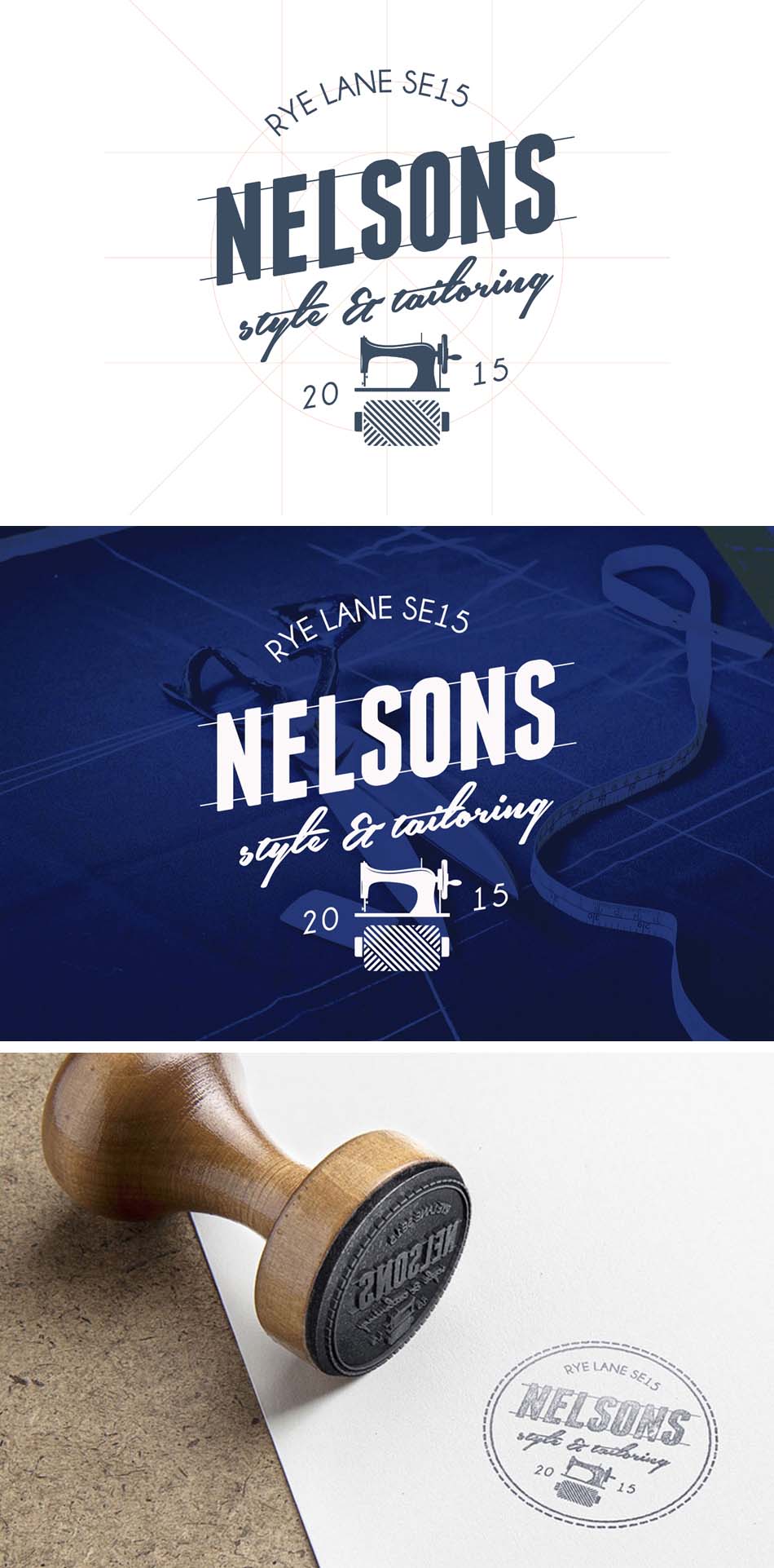
So when designing an identity for mens tailoring and fashion outlet, Nelsons, within the rejuvenated area of Peckham South-East London, my goal was a balance of depth with a timeless, and dare I say it, ‘trendy’ aesthetic.
Offering cool classy threads with a sophisticated edge, Nelsons stock unique short run designs using quality materials, all wrapped up through the approach of a personal tailored experience. They are friendly, passionate and fashionable just like the logo.
You can see my outcome below, with more to follow soon including letterpress and fabric prints and even some gilded window signs. Very Hipster. …Oops!